Desktop & Mobile web & App September 2024 – March 2025
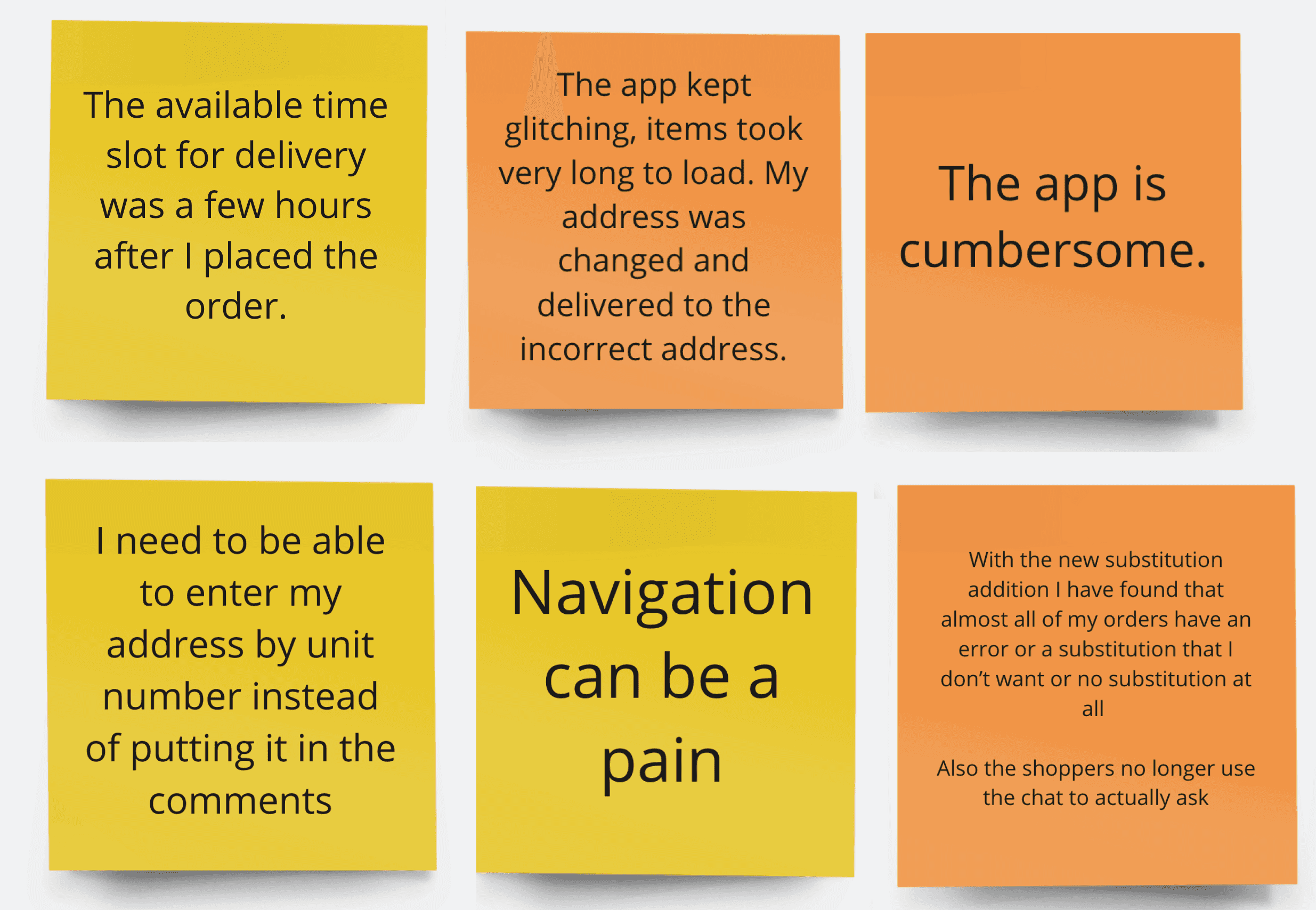
The previous checkout experience had a 65% cart abandonment rate, driven by a fragmented, multi-step process, unclear messaging, and limited delivery slot visibility. These issues, addressed with reactive fixes, caused user frustration and lost revenue. This project aimed to streamline the checkout and fulfilment journey, focusing on long-term scalability and a cohesive user experience.

As the Product Designer, I led the design of a scalable checkout experience across Web, App, and Mobile Web. Over eight months, I worked closely with product managers, engineers, and stakeholders to create a unified experience. In addition to the core checkout flow, I co-designed enhancements for Order History and supported the Payment & Fraud team with a new tender type. This work was part of a larger effort to unify Woolworths’ digital touch points in preparation for a tech stack transition.
The main goal was to reduce cart abandonment and align the user experience across platforms. I focused on simplifying the checkout flow for both new and returning users, using progressive disclosure to guide users step by step through the process.
Increased Checkout Conversion: Track uplift in checkout completion rate across both web and app.
Reduced Time to Checkout: Monitor average time from cart to order confirmation.
Lower Drop-Off Rates: Measure reduced abandonment at key friction points (e.g. delivery selection, payment).
Fewer Manual Workarounds: Reduction in BAU tickets and manual interventions for order or fulfilment issues.
Simpler Architecture: Ability to configure or test fulfilment rules without engineering support.
Improved fulfilment rates: Increase in delivery accuracy.
Increased Speed to Experiment: Ability to test new fulfilment options (e.g. smart bundling, express) faster and more flexibly.
Improved Scalability:
Confidence in the system’s ability to scale with peak traffic and future capability needs.
Key Design Decisions
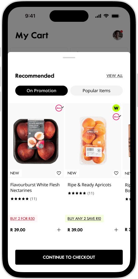
Cart Improvements
Research and usability testing made it clear: users needed better control over their baskets. I redesigned the cart layout to prioritise basket management, making it easier to review, update, or remove items. Pricing was also made more transparent with clear breakdowns of costs, discounts, and delivery fees.
Rethinking the Checkout Flow
The previous accordion-style checkout overwhelmed users with too much information at once. I introduced a progressive disclosure model that broke the process into smaller, more manageable steps. This reduced cognitive load and helped users stay focused.
“One-Click” for Returning Users
For returning customers, I designed a streamlined checkout that reused saved addresses, payment methods, and preferences—removing unnecessary friction and speeding up the path to purchase.
Fulfilment-Specific Flows
Checkout needs differ depending on what’s being ordered. I created tailored flows for food vs. fashion/home products, aligning layouts and logic with user expectations and operational requirements.
Ensuring a consistent user experience across web, app, and mobile web was a key objective. I made sure that layouts, flows, and interactions felt familiar on all devices, reducing the learning curve for users. By leveraging the strengths of each device (e.g., swipe gestures on mobile, expanded views on desktop), we ensured that the user experience was optimised without losing functional parity. I also ensured that messaging, labels, and error handling were consistent across touch points, which helped build trust with users.
The responsive design system I implemented scaled well across devices, ensuring that no critical content was hidden or misaligned. Additionally, the fulfilment logic worked identically across platforms, reducing mismatched expectations for users.
The redesign led to significant improvements in the user experience, but in hindsight, a more phased approach-tackling one journey or page at a time-could have been more effective. Aligning the app and web journeys helped create a unified experience across platforms, and ongoing research and testing will be necessary to refine edge cases and further improve the user experience.